How to Forecast IT Project Costs Using BigQuery and Monte Carlo Simulations
One challenge with forecasting in general is that forecasts typically don't incorporate a view on the potential variability of outcomes: budgets and forecasts are often expressed as point estimates. This hinders in-depth analysis because projects with the same point estimate forecast might have very different ranges of possible outcomes: one might have a narrow probability distribution around the mean, so the forecasted outcome is very likely to happen, but another might have a wide distribution, and a third might have a lower bound close to the mean but an upper bound shaped like a long tail – a small probability of catastrophic outcomes. These projects should be approached differently.
Here, Monte Carlo simulations allow finance teams to:
- Account for dependencies – Model how different risk factors (e.g., vendor delays, scope changes, market conditions) interact with each other, rather than treating them as independent variables.
- Incorporate uncertainty – Instead of assuming a single expected cost overrun, simulations generate a range of possible outcomes, helping decision-makers prepare for best-case, worst-case, and most likely scenarios. So instead of saying, "This project will cost $5M," leaders can assess the likelihood of different outcomes, such as "There’s a 30% chance of a 50% overrun, but a 5% chance of a catastrophic 300% overrun."
- Run scenario analysis at scale – Monte Carlo enables thousands (or even millions) of “what-if” scenarios, identifying tail risks and outliers that would otherwise be missed in a simple historical analysis.
By combining empirical historical data with probabilistic modeling, Monte Carlo simulations provide a realistic, flexible way to forecast IT project costs—leading to more accurate budgets, better contingency planning, and reduced financial surprises.
Example: ERP Cost Overruns from Historical Data & Distribution Analysis
A company considering an ERP implementation could analyze historical data:
-- Compute percentiles and standard deviation for cost overruns
WITH cost_distribution AS (
  SELECT
    final_cost / initial_budget AS cost_overrun
  FROM it_projects_data
  WHERE project_type = 'ERP Implementation'
)
SELECT
  APPROX_QUANTILES(cost_overrun, 100) AS percentiles,
  STDDEV(cost_overrun) AS std_dev,
  AVG(cost_overrun) AS avg_overrun
FROM cost_distribution;
By analyzing actual distributions, executives can see that while some ERP projects stay close to budget, others exceed their initial estimates by 80% or more. Instead of assuming a fixed buffer (e.g., 10%), they can set a budget that reflects empirical cost trends, reducing the risk of surprises.
To visualize the distribution of cost overruns, we can generate a histogram of past projects using BigQuery and Python.
One of the advantages of BigQuery Studio (the subject of an upcoming article) is its ability to run Python-based data analysis directly inside Google Cloud. This allows finance teams to query cost overrun distributions and generate visual insights. Below is a Python example to create a histogram from BigQuery data. This allows finance teams to:
- Pull historical data from BigQuery
- Run Monte Carlo simulations to model cost risk
- Generate risk-adjusted budgets before project approval
Visualizing Cost Overruns with Python
Once we have retrieved the cost overrun data from BigQuery, we can use Python to create a histogram for easy visualization:
import pandas as pd
import matplotlib.pyplot as plt
from google.cloud import bigquery

# Initialize BigQuery client
client = bigquery.Client()
query = """
SELECT final_cost / initial_budget AS cost_overrun
FROM it_projects_data
WHERE project_type = 'ERP Implementation'
"""
# Run query
df = client.query(query).to_dataframe()

# Plot histogram
plt.figure(figsize=(8, 5))
plt.hist(df['cost_overrun'], bins=30, edgecolor='black', alpha=0.7)
plt.xlabel('Cost Overrun Multiplier')
plt.ylabel('Number of Projects')
plt.title('Distribution of Cost Overruns in ERP Projects')
plt.grid(axis='y', linestyle='--', alpha=0.7)
plt.show()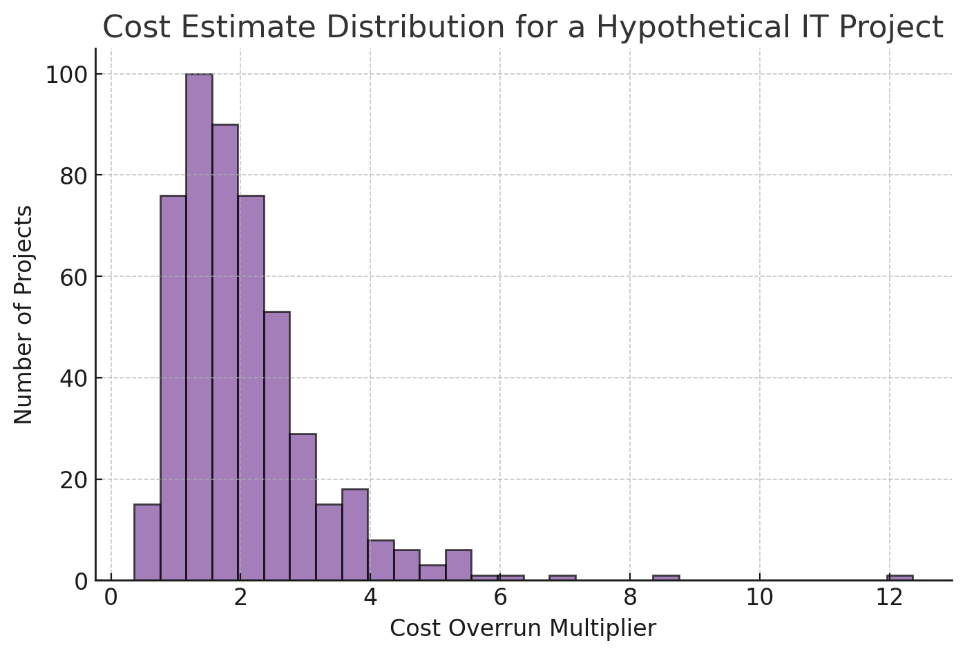
This visualization helps executives and finance teams understand the distribution of cost overruns rather than relying on averages alone.
Further reading
Flyvbjerg, Bent and Budzier, Alexander and Lee, Jong Seok and Keil, Mark and Lunn, Daniel and Bester, Dirk W., The Empirical Reality of IT Project Cost Overruns: Discovering a Power-Law Distribution (August 30, 2022). JOURNAL OF MANAGEMENT INFORMATION SYSTEMS, 2022, VOL. 39, NO. 3, 607–639 https://doi.org/10.1080/07421222.2022.2096544, Available at SSRN: https://ssrn.com/abstract=4204819